The private school admissions process has seen some big changes over the last few years. Families looking at private schools today have high expectations about clear communication, personalized content, and flexibility, and understanding these changes is key to making sure your school meets their needs.
Your prospective families don't want to be marketed to, but rather, they want to be heard by real people who understand their goals and challenges, and those influences are found everywhere. Decisions take longer because of a variety of influencers, including social media, word-of-mouth, and the variety of content that fills every minute of their screen time.
If inquiries were down this season and you're wondering how to increase enrollment at your private school, your website might be plugging your admission funnel even before families decide to inquire — long before you have the chance to exceed families' standards.
The funnel becomes both wider and longer, and while we have the capability to cast a much wider net earlier on, it also takes much more time, effort, and content to get a conversion.

That being said, your website (and all your digital strategies) needs to keep in mind that you have two types of prospective families visiting your school's website: high-commitment visitors and low-commitment visitors.
High-commitment visitors are ready to apply and require little to no nurturing. In short, your school is their top choice, so they will be forgiving with aspects of your process. However, these visitors are much less common than low-commitment visitors.
Low-commitment visitors are the prospects who are just shopping around and wanting to learn more. They need help making a decision, and your school is just one of many options. These visitors are at the very top of the funnel, and your website is the first opportunity you have to gently nurture them down.
Your school's website must be designed to appeal to low-commitment visitors — as they are the most prevalent and require the most attention. This means re-evaluating these three common website mistakes.
Mistake 1: You're Still Using Long SIS Inquiry Forms
Imagine this: you're online shopping for new sneakers — and to learn the details of a particular running shoe, you need to provide at least 12 form fields of information about yourself. And that's just to learn more.
Would you take the time to fill out the form, or would you be discouraged and head back to Google? The majority of us (low-commitment visitors) would head back to Google, while a few (high-commitment visitors) would stay because they know that sneaker is the one.
It's a simple analogy, but it gets you thinking... If you're asking a prospective family to share every last detail about themselves just to get an email from your admissions team, you've just put a plug in your funnel.
ONLINE FORMS WORK THIS WAY:
As a prospect, I am willing to share this information about myself to get something of value from your school in return. What is being provided by your school should always be a greater return or reward than what was provided. But with those long SIS inquiry forms, they are receiving very little for the amount you're asking — resulting in extremely low conversion rates.
When creating an inbound marketing form, like a newsletter subscription list, a resource download, an event sign-up, or even your inquiry form, here are a few stats to think about:
- There is a 120% increase in conversions when you reduce the number of form fields from 11 to 4
- There is a 20% conversion rate on forms with only 3-5 fields
- The average conversion rate on a form with 11+ fields is only 5.4%
Long, unbranded forms like this one below, are just plain scary — and not mobile-friendly.
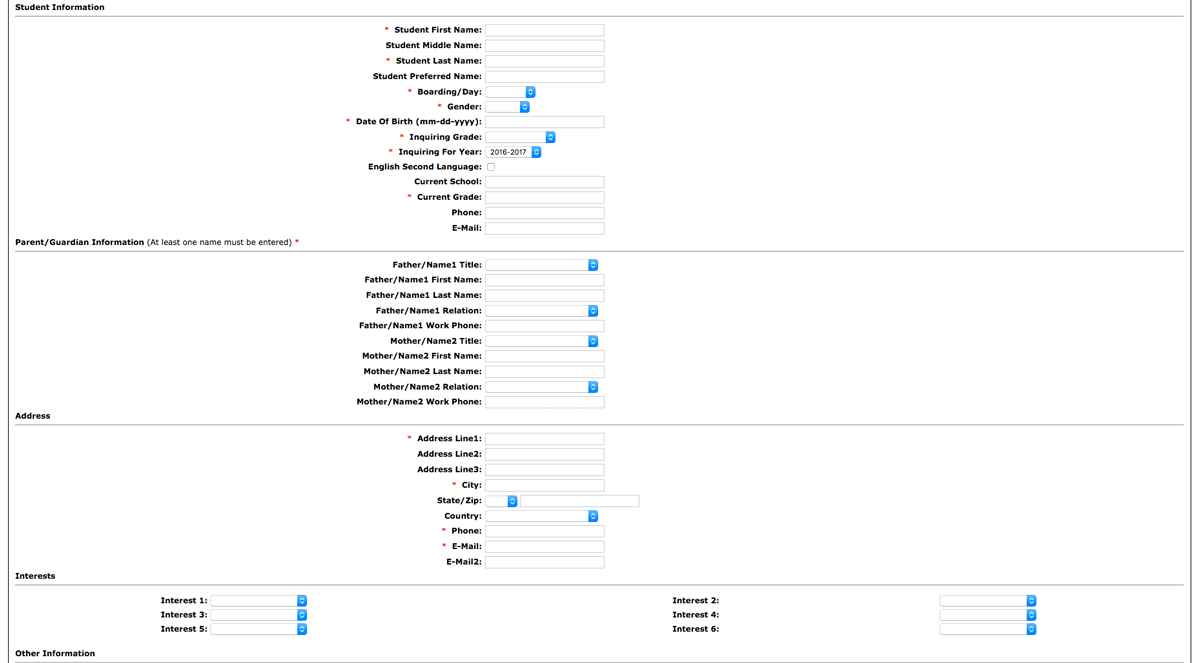
Instead, keep your admissions forms brief, branded, and embedded. Central Catholic High School uses Finalsite's enrollment management software to streamline the enrollment process. They're shortening the inquiry form by using conditional fields and asking relevant questions to personalize their admissions office's communications, (like interests, school year, and extracurricular activities), and it looks great on desktop AND mobile.

Mistake 2:You Have a Poorly Executed Tuition Page
A school's tuition page is typically in its top 3 most visited website pages — and yet, it's never treated with such importance — just some plain text of tuition, fees, processes, aid, etc.
The best tuition pages shouldn't just list information but should be treated as a prime opportunity to share your school's story and get families started with the application process. Rather than just listing costs for your school, think of your tuition page as a place to tell a story, and be sure to include:
- A value proposition
- A video or photo slideshow
- Information on affordability
- Social proof (AKA testimonials)
Keep Reading: 4 Tuition Page Best Practices Proven to Increase Conversion Rates
Mistake 3: Your Social Proof is Limited to a Single Page
"Word of mouth" marketing is the number one way families find out about schools—backing up that what people have to say about your school bears a lot of weight in the decision-making process.
- Over 70% of Americans say they look at reviews before making a purchase
- 63% of consumers are more likely to purchase from a site if it has reviews
- 70% of people will trust a recommendation from someone they don't even know
- Testimonials on a landing page can increase conversions by 34%
With these stats in mind, it's apparent that simply keeping a slider of testimonials on your homepage isn't enough. With prospective students and parents entering your website through a variety of pages (tuition, athletics, admissions, etc.), social proof must be on your school's most important landing pages.
A FEW TIPS FOR SHARING SOCIAL PROOF ON YOUR WEBSITE:
- Keep them brief, with the option to "Read More"
- Don't put the same testimonials on every single page
- Consider which pages you want to add testimonials to, and then gather page-specific testimonials that really sell value
Another website mistake that could be plugging an admissions funnel is a lack of effective, engaging content that resonates with your target audience. Here's why it's a problem and how to fix it:
Non-Engaging Content
If your website's content doesn't grab the attention of prospective families, they may lose interest quickly. Content that fails to highlight what makes your school unique, or doesn't speak to the specific interests and needs of families, can be a major deterrent.
How to Fix It:
- Tell Your School's Story: Use compelling narratives to showcase your school's values, culture, and offerings. Share success stories of students and alumni to illustrate the impact of your education.
- Interactive Elements: Include interactive features like virtual tours, video testimonials, and Q&A sections, which make the experience more engaging and informative.
- Regular Updates: Keep your content fresh with regular updates, news, and events. Show prospective families that your school is vibrant and active and has so much to offer.
Key Takeaway
Your website plays a crucial role in attracting and nurturing prospective families. It's important to recognize the shift in family expectations toward clear communication, personalized content, and flexibility. To effectively engage with both high-commitment and low-commitment visitors, avoid lengthy inquiry forms, poorly executed tuition pages, and limited use of social proof that turn people away.
By refining your website and digital strategies, you can more effectively guide families through the admissions funnel and increase enrollment.