![5 Design Trends to Watch in 2018 [Webinar Recap]](jpg/2919.full.jpg)
The holidays are upon us and it's almost time to pack up for holiday break. This also means 2018 is right around the corner, and with a new year comes new trends and updates schools need to know! Whether its changes you should be making on your website before 2018 like site speed and website accessibility or new search engine trends you need to start paying attention to such as online reviews, we've been doing our homework to get you ahead of the biggest trends and changes schools will be affected by after the new year. Specifically for your school website, there are key design trends you should be on the lookout for in the new year if you're hoping to improve your website or begin a redesign.
Kealan Duffy, UK Production Manager, and Julianne Hamilton, award-winning Senior Designer, recently highlighted five of the top design trends for schools to watch in 2018.
Many factors drive new design trends, including:
- Shifts in user behavior
- Changes in collective taste
- Advances in web technologies
- Benefits to user experience
These changes all have one thing in common: your website visitor. It's imperative to stay up-to-date with their needs and preferences to keep improving their overall user experience.
Technology is also a driving factor for these trends. For example, new coding languages allow Kealan, Julianne, and other designers to incorporate new features into the school sites they are designing.
Overall, the following five design trends will not only stay ahead of the newest advancements of technology, but also improve your user's experience and keep them coming back to your site:
1. Mobile-First
Responsive design is no longer a trend, but rather a requirement. Your school website needs to be responsive or it can become problematic not just on mobile devices, but also in search and on social media.
Mobile continues to influence our designers as they approach a new website or redesign project as they now have to consider how a website looks on both desktop and mobile simultaneously. Our designers consider how content will collapse and resize, and in some cases, create different designs to ensure an optimized experience on all devices. While you can still access all of the content, you do so in two different ways to optimize each experience.
According to Kealan and Julianne, designing for mobile can be tricky as there is less space. However, some best practices that can be done for an improved mobile user experience include:
- Less text and simpler messages
- Optimized and fewer images
- Larger buttons
- More use of negative space
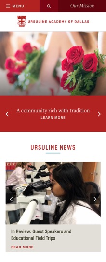
Ursuline Academy of Dallas' mobile design is another perfect example of what a mobile design should accomplish. The content is collapsed and stacked in an organized format. The headers expand within the content areas and it overall is not overwhelming to scroll through:
2. More Varied Layouts
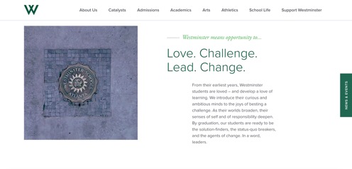
One of the biggest problems we see with websites built using an Open Source platform is the websites look very similar to others. As a school, you not only want to highlight what makes your school unique in your website content, but you should also strive to have a different look for your website as well. (You also don't want your school's website to have the same template as a food blog or ecommerce site.) As we approach 2018, there will be more varied layouts to set up your website so it can share your school's story in a new way.
Coding advances are now allowing designers to incorporate much more variety in responsive web design layouts, including:
- More open compositions
- Asymmetrical balance
- Overlapping shapes
- Less obvious grids
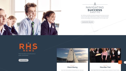
Royal Hospital School, for example, recently re-branded and wanted their website to reflect the school's new look. The homepage's layout is not your typical grid. Every tier has a different feel to it. The site uses negative space appropriately to draw attention to each tier's title and content, and helps bring energy to each section on the homepage. This also helps bring the school's brand personality across and shows how authentic and engaging your website's experience can be:
William Penn Charter School's award-winning microsite is another great example of how variety in layout can take your site's design to a new level. The site incorporates an interesting variety of shapes that not only are set up in a fun way, but are animated throughout the site offering a different user experience. What's important with how this works, however, is it does not interfere with the end user's ability to use the site or gets in the way of what the user is trying to accomplish while visiting the site:
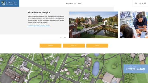
Finally, Choate Rosemary Hall is another great website that incorporates a creative layout based on the school's history, story, and modern approach. The site knows who its target audience is, and is able to convey a layout that compliments classic fonts and graphics to offer a good balance of the school's personality and prestige with a fun, updated design:
Discover these trends in action in this on-demand webinar now.

3. Moving Beyond the Hero Slideshow
Your school's website is your most important marketing tool and in some cases, the first impression you ever make. Though they are still commonly used, visitors don't spend as much time viewing slideshows as we think they do because attention spans are becoming shorter. As we move into 2018, it's time to start thinking about other ways you can tell your school's story to keep users engaged on your website.
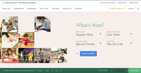
The Woods Academy, for example, is an award-winning design that isn't your typical scrolling, panel design. Rather, they share all their content in a single, horizontal scrolling panel. A user can then follow their story through this unique type of website scroll, as it moves horizontally instead of vertically. This gives the school an opportunity to share photos, news, and other relevant content in the same space on the homepage. Finally, the story ends with a section offering call-to-action buttons for a user to take a next step on the website:
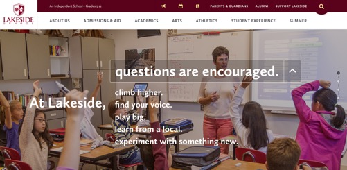
Lakeside School is another great example as its homepage offers a drop down call-to-action immediately at the top of the page with a large image. Once someone selects a topic from the drop down, more content pops up on the right side of the page for a person to learn more about the topic related to the school's story and mission. This not only fits their school's voice and personality, but also draws attention to the call-to-actions throughout the homepage and supports the site's narrative:
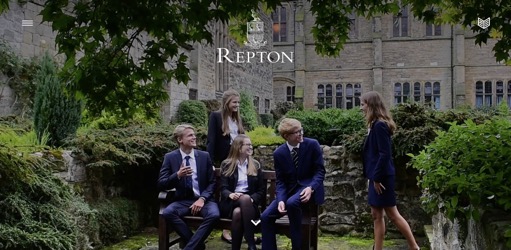
Finally, Repton School has a hero element that is actually a cinemagraph, which is a still photo with a looped motion almost forming a video clip. Cinemagraphs are not commonly used on websites right now, but they do have their benefits. Since most of the page is an image, this does not slow down the site's load times. For this school in particular, this cinemagraph was the right choice to get their message across:
4. Personalized Content
Personalization is all about bringing appropriate and targeted content to the right visitor at the right time. This trend in particular will especially improve the user experience on your school website since the messaging behind the content will be unique to their needs, desires, and pain points.
There are multiple ways of customizing the content based on the visitor's:
- Demographic (e.g. their location)
- Behavior (e.g. the pages they visit)
- Context (e.g. the device they are using)
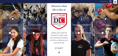
Dubai College, for example, wanted to showcase the school's multiple activities for any website visitor. They incorporate personalized content by asking the visitor to select a level of interest based on their values and goals. Through this personalized approach, the homepage re-organizes the content based on the interest selected, improving the user experience and bringing the content right in front of the end user instead of having them search for it:
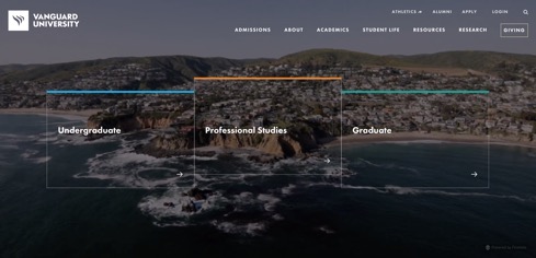
Another great example is Vanguard University. One of the issues they were hoping to resolve with their redesigned website was ensuring whoever visited the website, whether it was a prospective student or graduate student, knew where to go to on the website. The homepage now has three entry points based on the area of study that any member of any audience can select to find content specific to the group selected:
5. Purposeful Motion
Motion is known as the texture of modern web design. It helps guide the visitor through your website, and can easily bring it to life in a new, engaging way. A few ways you can use it on your school site include:
- Videos and cinemagraphs
- Scroll and hover based animations
- Animated cues (e.g. scroll down animation)
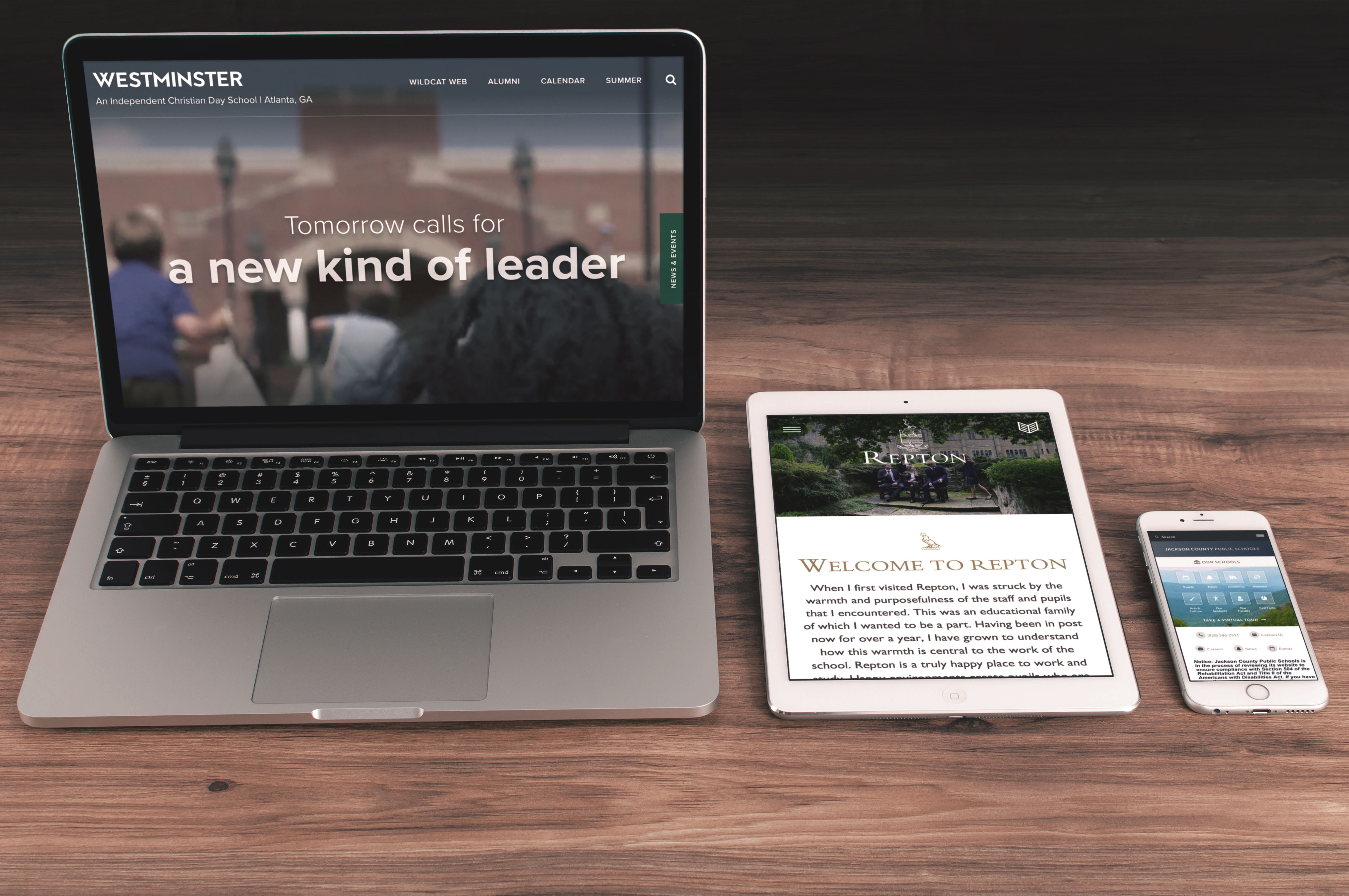
Westminster, for instance, begins its homepage with a video, but takes the animation one step further as the user begins to scroll down the page. The hero video is moved into the next tier so a user can continue watching it while they begin to read the school's value proposition and mission. This type of animation through videos and images encourages the end user to stay on the site and see what will come next:
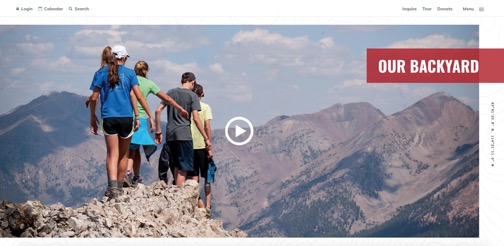
Community School is another school that uses the right amount of animation on its homepage. They not only use a full page video at the top of their homepage, but they use a hover over effect under the different divisions and programs. Furthermore, its section "Our Backyard" uses a unique kind of motion when you move your mouse around over the image, making the hike come alive through the animation:
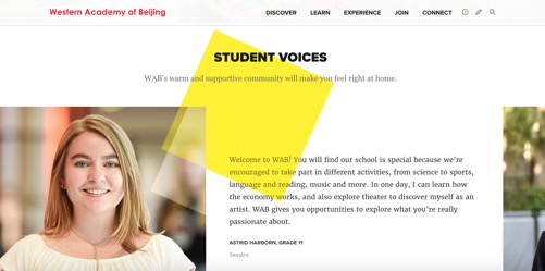
Finally, Western Academy of Beijing not only highlights its community focus throughout its homepage, but it incorporates fun branding and shapes that appear and move as the end user scrolls down the homepage. They don't need to add additional content to convey its personality. Rather, it's found through the layout and motion any user can experience when they first go to the site:
Key Takeaways
Regardless if you plan on redesigning in 2018 or just launched a new site, the most important aspect to remember is your school website needs maintenance, attention, and updating. Consider which of these trends are right for your target audience. Also, ensure they work in support of your messages and website content as a whole. It's okay to take creative risks, but start with a clear goal in mind. Overall, any changes or updates you do make should always prioritize a clear and usable experience for your website's visitor.
If you're envisioning a facelift for your school's current website, let us know and we can start helping you just in time for the new year!

ABOUT THE AUTHOR

Stephanie brings a fresh new marketing perspective with her background in social media, communications, and radio broadcasting. She is a co-producer for the FinalsiteFM podcast network and is passionate about helping schools stay ahead of their marketing goals by tracking new trends and developments. She is also a practicing singer/songwriter and loves to expand her creativity in DIY projects.


