
In working with international schools around the world, Finalsite helps schools share their stories through award-winning websites and digital communication tools to further engage their community. Whether you have an eye for design, a love of storytelling, or like simplicity, these websites share:
-
Design trends that engage
-
Clear and concise site content that communicates and engages
-
Site navigation that helps guide visitors
-
Social media integration to share authentic content
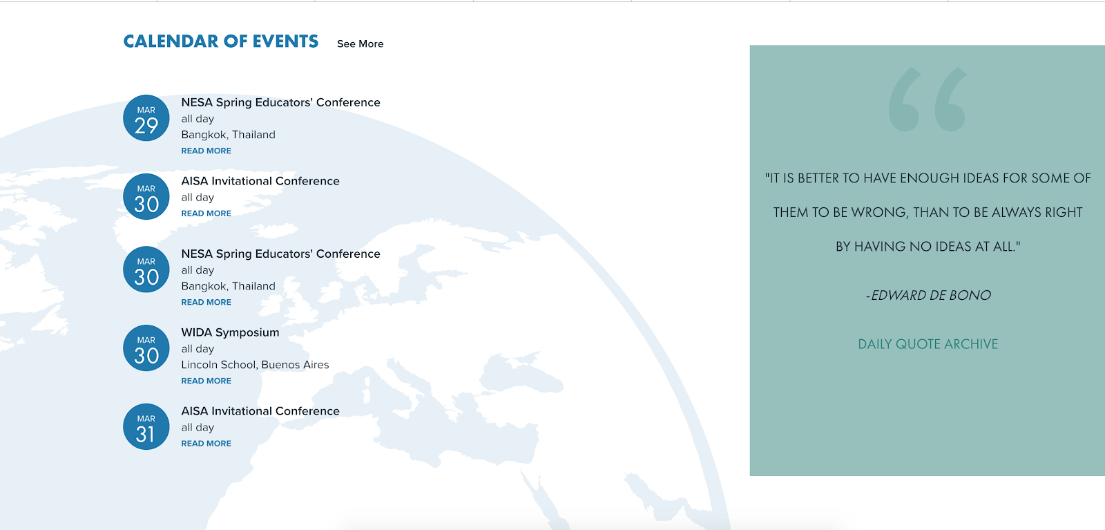
AAIE (Association for the Advancement of International Education)
AAIE kicks things off with a sharp looking website!
It's always a pleasure to partner with a member organization that serves our schools; and one like AAIE that serves the international community, makes it even more interesting. The challenges that international schools face are unique, complex and constantly evolving, and AAIE’s role in supporting schools through this dynamic environment is critical.
I love seeing how our designers capture an organization’s mission, services and values in a way that’s intuitive and compelling. But what I find most innovative about this website is how the content works so well for desktop and its mobile counterpart. Case in point, the homepage on the desktop shows a nice, interactive graphic to illustrate its “Five Ideas for the Future,” but on the mobile view it's a collapsed, colorful and efficient layout of the same. Likewise, the calendar of events on the mobile view is clear and easy to read. The desktop version adds a call out testimonial to balance the space.
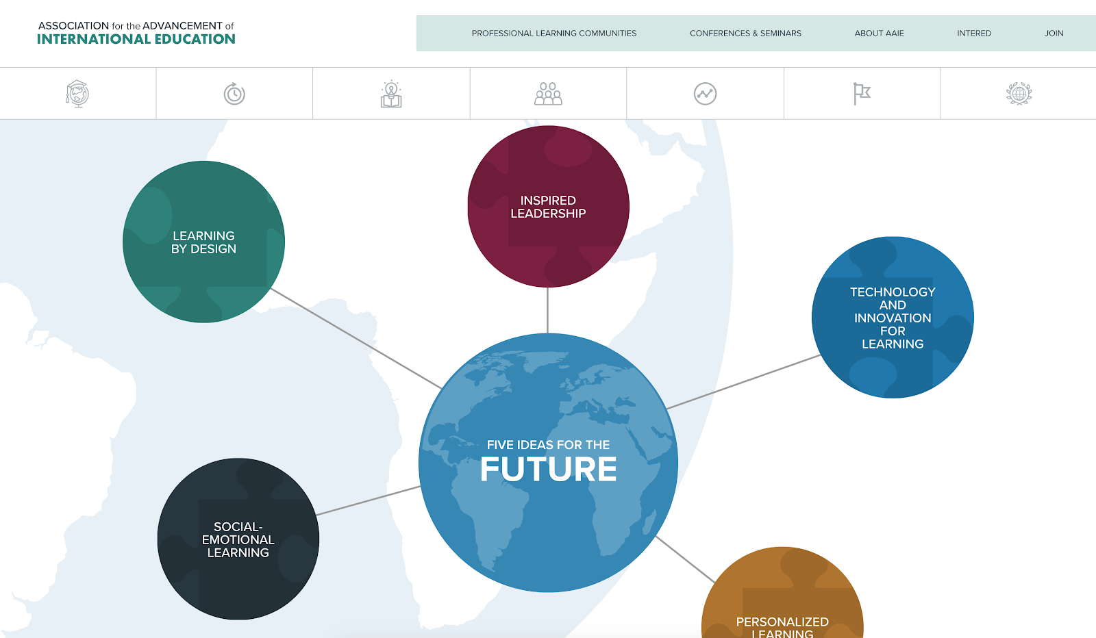
Behind the scenes, Finalsite’s Personalization element is working its geographic magic by serving up different quotes based on where the visitor lives. Cool, huh? International schools are lining up at the door to get this technology installed on their website to send the right message to the right regions. Like AAIE, we want to make sure our software supports the international community in innovative and affordable ways.
Great use of video using Resources, too. Check it out!
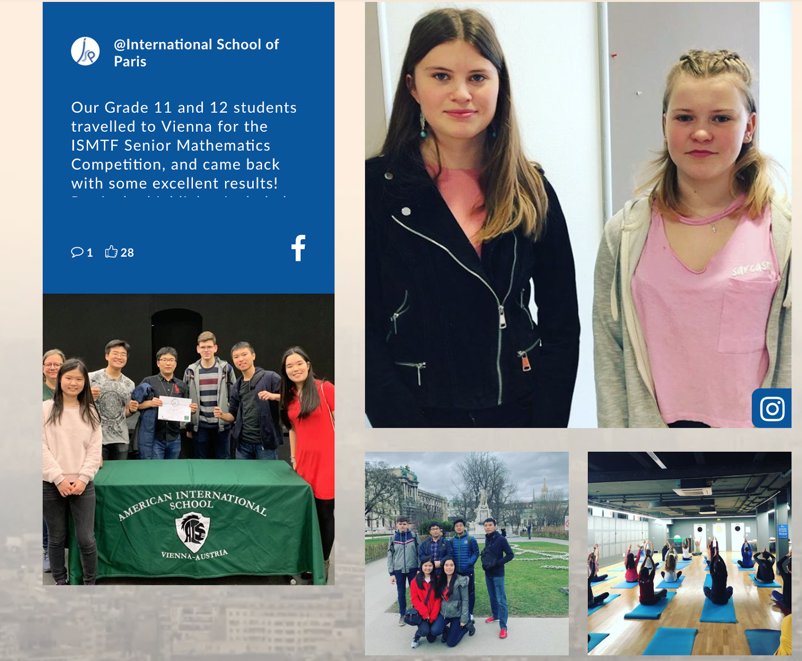
The International School of Paris
The International School of Paris gets right to the point with these four stats outlined in an infographic: this school is centrally located, has tradition and history, and is amazingly diverse -- a story told in about 20 words.
Their use of integrated social media, using Finalsite Feeds, supplements these facts with authentic student voices and snippets of what’s happening there and now.
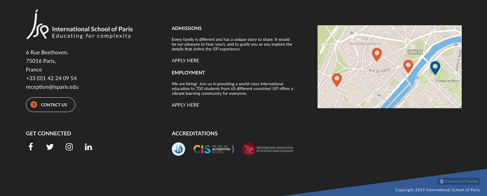
A well-designed footer does the heavy lifting in a succinct format, with contact information, accreditation, a map, social media links, employment information, and admissions links. This kind of layout looks easy, but I’m always amazed by how our designers pack it in without the information feeling overwhelming.
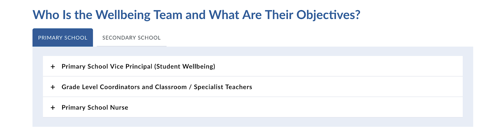
On a more routine note — but just as critical - I like how the school uses a combination of accordion and tab elements to share their “Well Being” information, clearly an important component of their value proposition for prospective families.
The Tier One and utility navigation are well structured, and the toggle between French and English make for an easy-to-use multilingual website.
Not that I’d need any convincing to live in Paris, but I was glad to see a “Living in Paris” page in the Admissions section. This information is convenient and extremely helpful. Good job!
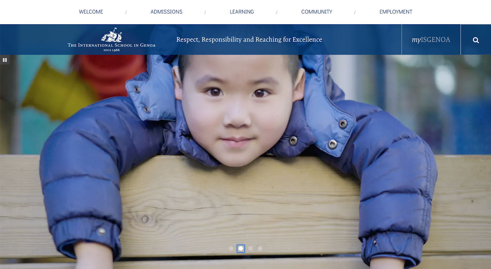
International School of Genoa
With 363 students, the International School of Genoa is small by most measures. But, wisely, they position that as a strength. Leveraging a Finalsite Theme design provided them an affordable website design built on the Finalsite platform used by thousands of schools.
And it was fast! The site is still a work in progress (as most sites are!), with a start to finish timeline of three months. The website tells a story of a close-knit community, faculty engagement, and a vibrant academic program, all updated with a small communications team wearing a lot of hats.
Fabulous photography naturally brings the homepage to life. With four hero images in the slideshow, ISG brings emotion and spirit to bear.
Also worth noting, ISB's calendar events and news headlines feature fun and authentic pictures on the homepage that are clearly updated with fresh content.
ISB's site is small, and they continue to build up over time, but they have a great foundation now to add and develop as time passes.
Inter Community School Addis Ababa (ICS)
ICS Addis Ababa is one of those websites that is set up in a relatively ordinary way — large hero image, standard tier one navigation, nice utility navigation with icons — but the school continues to build momentum as you scroll down.
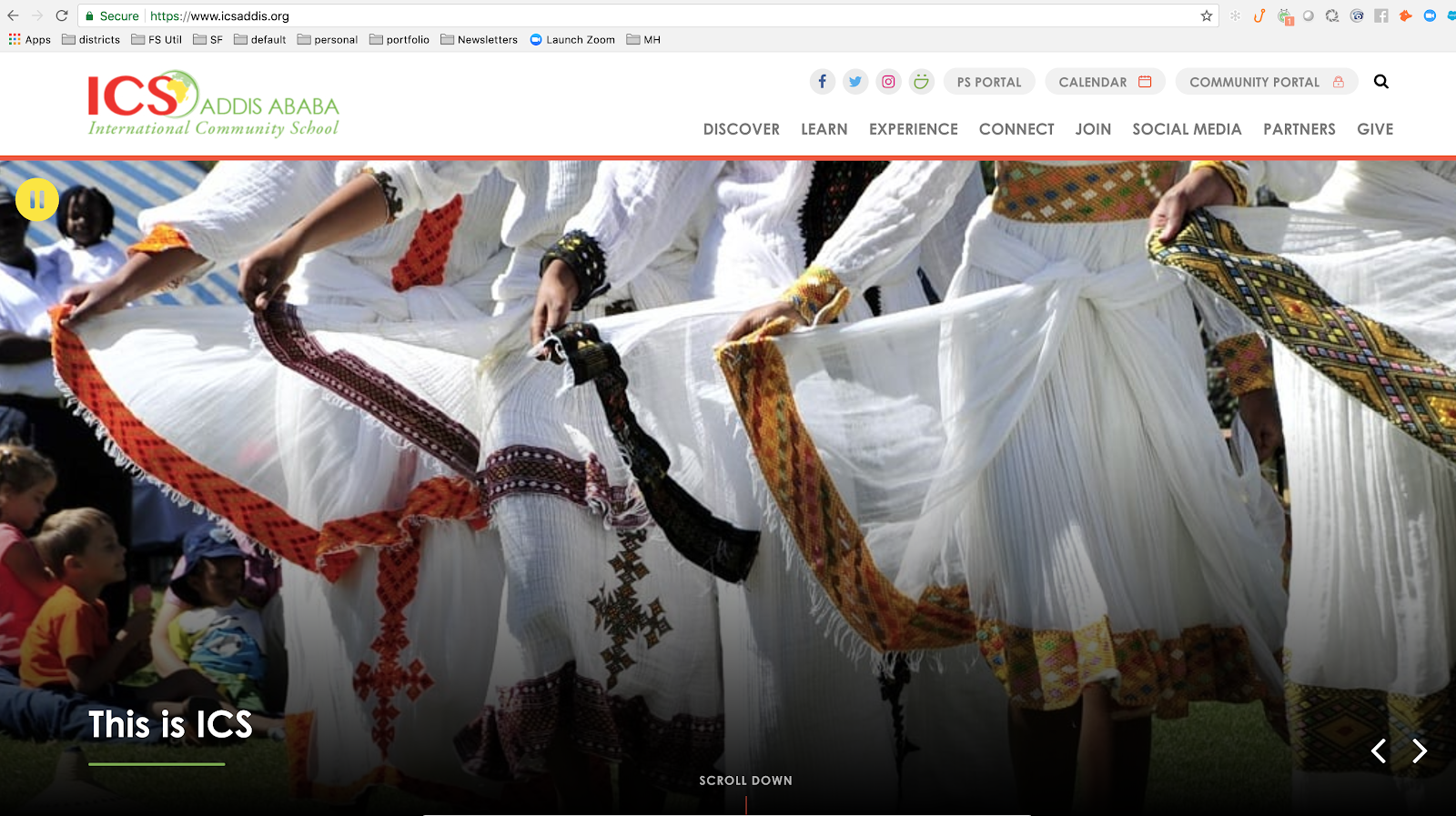
The animated welcome in the second panel draws you in to read the text, while the complementary circular photo helps break up the square grid. A parallax design uses strong photography as the “reveal,” while augmenting the division content that the picture supports.

Subtle animation of the news headlines, with pictures, and the upcoming events, keeps the user engaged and interested — just a spark of visual interest without being overbearing. And what a cool use of social media! Only with Finalsite Feeds could we pull this off. The circle “masks” that you’d expect to contain static content is ever-changing with Facebook, Twitter and Instagram posts. Great approach!

The homepage develops a full narrative about who the school is and what makes them so unique. The ICS “Definition of Learning” is clearly an important value of the school, and one that they share just after a very touching picture of young children walking through campus.
The footer does a nice job of providing all of the contact information you need, accreditation info and a shortcut to a map, as well as key links for accessibility and site map.
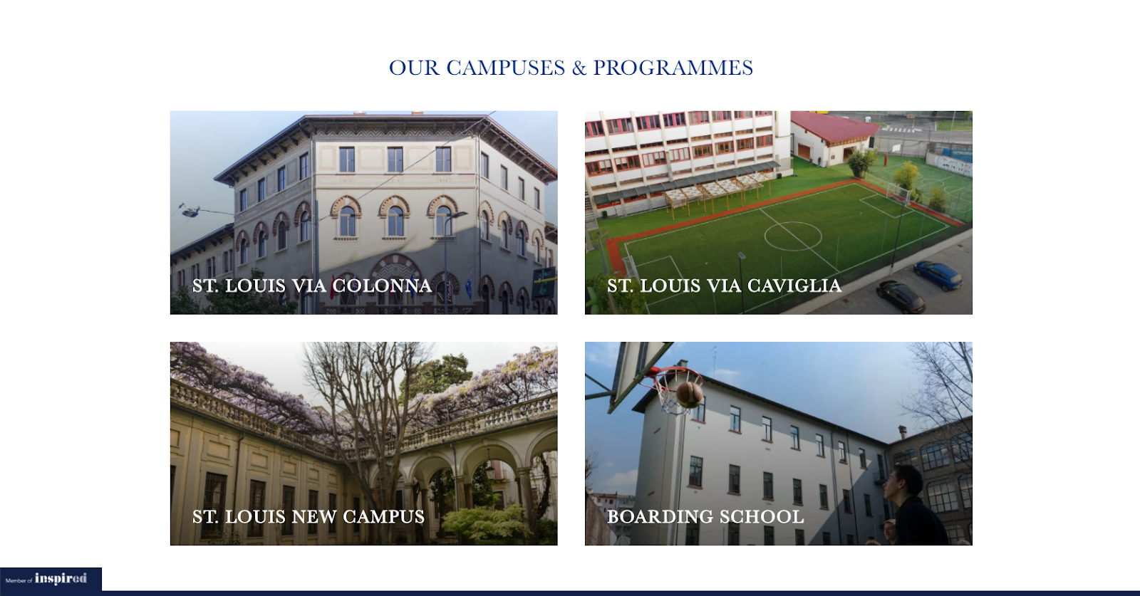
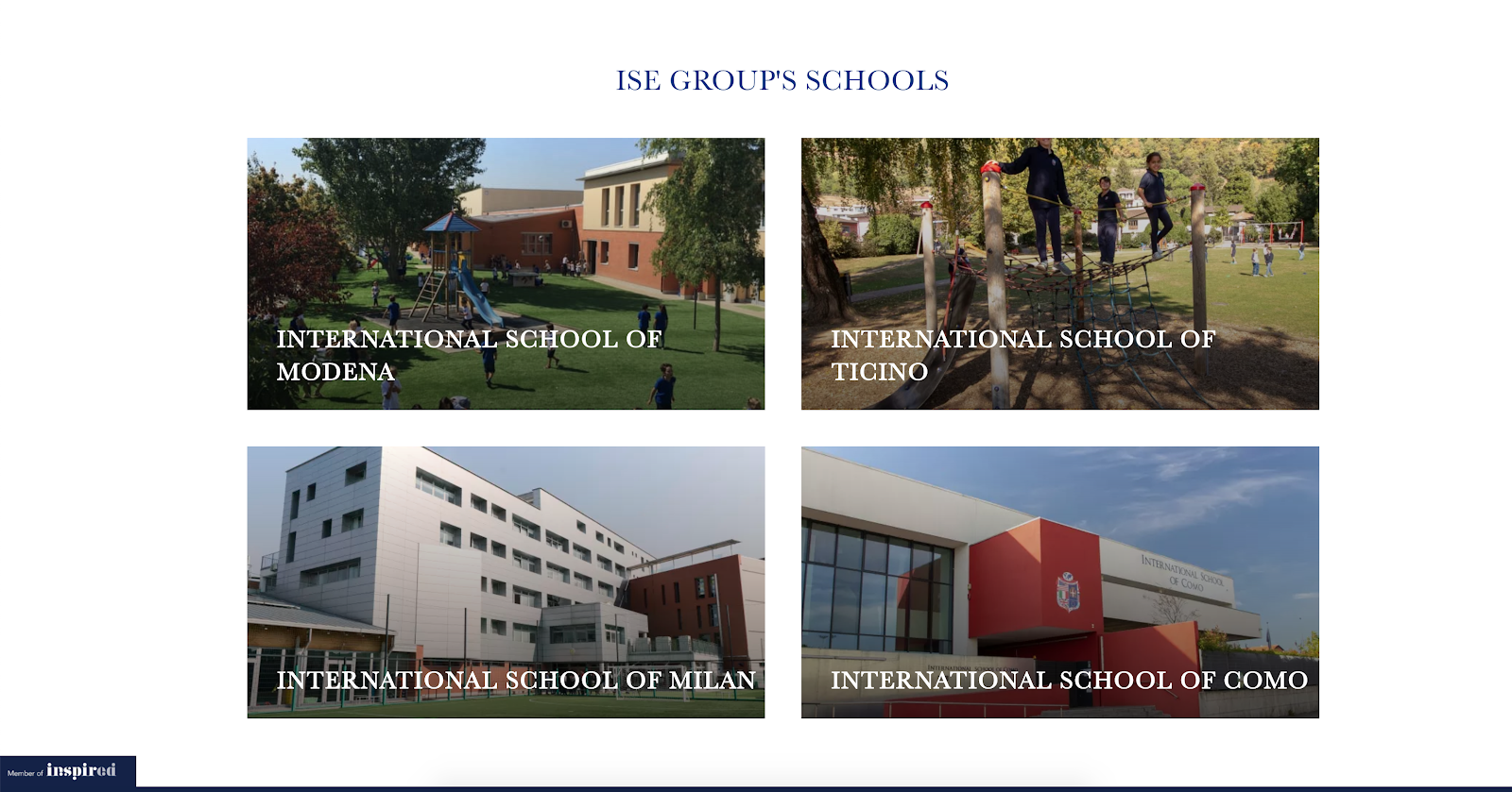
St. Louis School of Milan
The Inspired Group turned to Finalsite to launch St. Louis School of Milan, which was part of a number of websites for their network, including sister schools in Modena, Monza, and Tucino. Each website shares a design to maximize Inspired’s budget, while providing a platform that each school can use independently.
It’s interesting to see how each school leverages the same layout while personalizing the content to their audience. The “Our Campuses & Programmes” for St. Louis showcases their new campus, the boarding school component and some great views of the building.
The International School of Monza shows a different set of photos.
"Why Us” for St. Louis is shaped well for the content they have, with calls to action and succinct content.
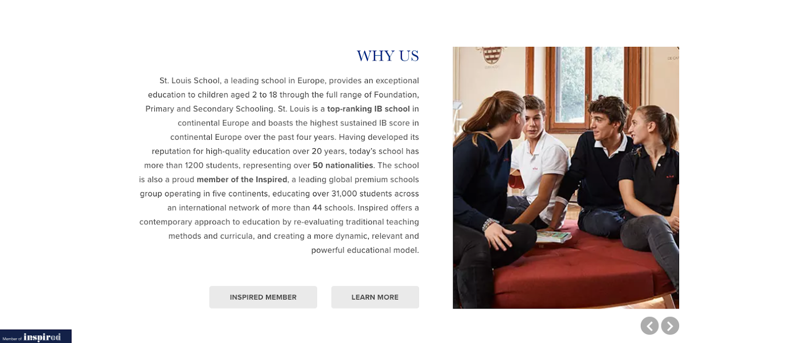
Likewise, the “Why Us” page for Modena uses the same panel but in a completely different way in terms of content and elements:
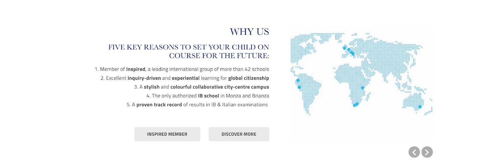
Not that we expect prospective families to be comparing websites like this, but it shows how best to scale when you’re managing a “family” of schools who each want their own approach and message, while also staying within the boundaries of an aesthetic. Great job!
Nishimachi International School
For the Westerner, it’s always cool to see Japanese in the header of a website. Combine that with a clean design and simple icon-oriented utility navigation, and you get a great final product.
Nishimachi International School's website aesthetic is very minimalistic — big, sans serif type, and heavy use of blocks and thick lines in the design counterbalance compelling photography of students and teachers that makes everything a bit more personal. The use of silhouetted artwork creates an added dimension that breaks up the straight grid, too.
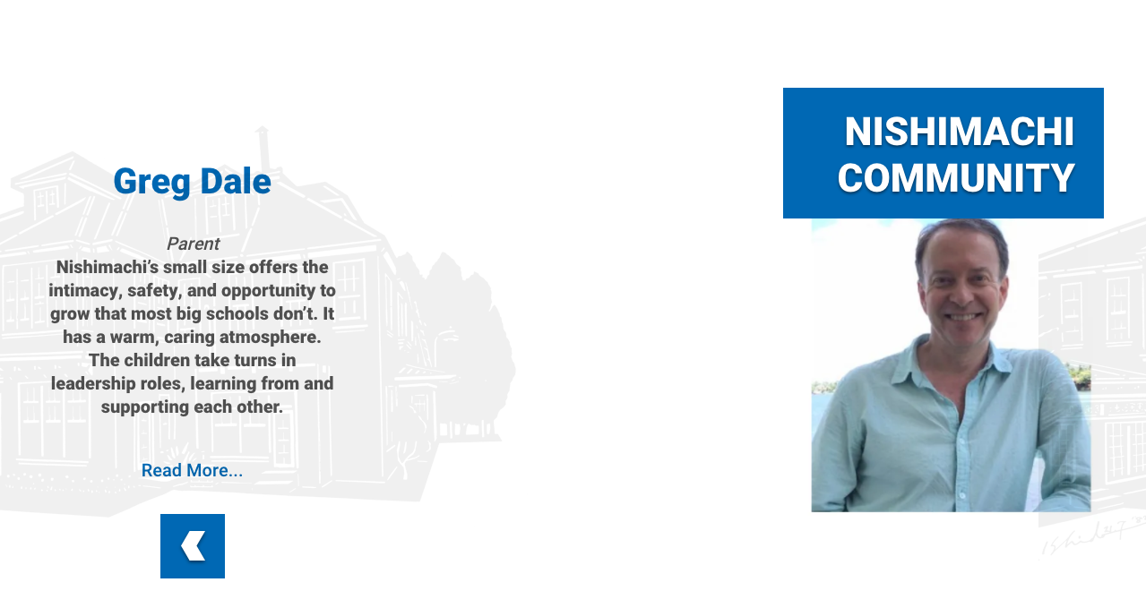
No one can miss these calls to action! It’s clear what this website is for: prospective families! It’s nice to see the decisiveness in design.
A bright, colorful website with a compelling story — glad to be working with this school.
This Just In: New Accolades for International School Websites
The AVA Digital Awards just announced FOUR design awards to Finalsite for our international and UK work. Many congratulations to our talented design team and the front-end developers and project managers who make it happen; we’re very grateful to have such a stellar team on board.
-
Leysin American School in Switzerland (Platinum award)
-
ICS Addis Ababa School (Gold award)
-
Queen Ethleburga's School (Honorable Mention)
-
Alleyn's School (Gold award)


ABOUT THE AUTHOR
Angelo graduated valedictorian from St. Paul's School in Baltimore, MD and from Princeton University. Despite getting his degree in creative writing and English Literature, it generally takes some doing to keep him from programming and breaking websites. Just after graduating, he started Silverpoint, and grew it to over 300 schools worldwide before merging with Finalsite in 2013.


