
In order to understand how to increase inquiries, it is important to understand the applicant journey. When we analyze a school's applicant's journey and the admission funnel, we consider three main stages, awareness, consideration and decision:
- Awareness: The stage in which they are weighing their options and aren't sure if they want to attend a private school in general
- Consideration: The stage in which they are choosing the private schools they want to learn more about
- Decision: The stage in which they decide which school to attend
If you're looking to increase inquiries, the website design for your school should focus on content and design elements that move a prospective student from awareness to consideration.
For content, you'll want to focus on value propositions, authentic content, and visual content to nudge your prospect down the funnel. Once your content is in place, you'll need to make that conversion as easy as possible.
How can you increase enrollment and get more school inquiries with your website's design? This is where the design and architecture of your school's website come into play.
1. Create an Engaging User Experience
The key to increasing student enrollment isn't just about attracting visitors but also about keeping them engaged and guiding them toward the desired action. Your school's website is often the first point of contact for prospective students and their families, so it's critical for the site to make a strong, positive impression and encourage inquiries. That means you’ll need:
Intuitive Navigation
- Driving Decision-making: You'll need clear menu structures that are easy to navigate and provide quick access to essential information, such as admissions processes, tuition fees, and academic programs. Empower potential students to make informed decisions — when users can find what they need quickly, they're more likely to take action, like filling out an inquiry form.
- Reducing Drop-offs: A confusing navigation structure can frustrate users, causing them to leave your early. An intuitive design retains visitors, giving them more opportunities to convert into inquiries.
Responsive Design
- Reach a Broader Audience: With the range of devices used to access websites today, responsive design ensures that all visitors, regardless of their device, have a positive experience. This mix maximizes the chances of conversion from every traffic source, like desktops, mobile devices, and even tablets.
- Higher Search Rankings: Search engines like Google LOVE to prioritize mobile-friendly websites. A responsive design can result in better search rankings, leading to more organic traffic and potential inquiries.
Interactive Elements
- Engaging Prospects: Dynamic features like slideshows, videos, and virtual tours can captivate visitors, giving them a more profound sense of your school's culture, values, and offerings. Engaged visitors will spend more time on your site, increasing the likelihood of them taking the next step in the enrollment process.
- Highlighting Value Proposition: Virtual tours, videos, and interactive galleries can effectively convey your school's unique selling points, like state-of-the-art facilities, dedicated faculty, or vibrant student life. Showcasing these strengths can be the tipping point for a potential student to inquire further or apply.
Every UI/UX decision should be made with the user's journey in mind. Your website should not only provide information but also guide prospective students and their families through a carefully designed pathway that leads to action.

2. Shorten Forms on a Unique Landing Page
While a short form may not necessarily be a school website design idea, it is certainly a design element that can boost your school's online inquiries. Because online forms are your school's biggest conversion tool, it's essential to consider the relation between form length, the level of commitment, and what is provided in return.
When the length of a form is shortened, the conversion rates are higher — much higher:
- There is a 120% increase in conversions when you reduce the number of form fields from 11 to 4
- There is a 20% conversion rate on forms with only 3-5 fields
- The average conversion rate on a form with 11+ fields is only 5.4%
For inquiry forms, we suggest using 3-6 form fields with contact information: first name, last name, email, and then 2-3 more fields you need in order to communicate with them and send targeted messages.

Baylor School has just three simple form fields for family members to fill on its embedded inquiry form, and then it redirects users to its streamlined enrollment process through Finalsite Enrollment.
The page on which a form is located should focus on giving that final nudge from awareness to consideration. An inquiry page should have important content elements that drive conversions, like value propositions, visual content, and social proof.
3. Use A Sticky Navigation with a Call-to-Action
A sticky navigation with a call-to-action (CTA) button is one of the best school website design enhancements you can invest in. A sticky navigation — whether docked on the top, right, or left — will follow your user everywhere they go on your site, making it easy for them to make the next step in the process, whether it be to inquire, apply, schedule a tour, or give.

We recommend using a sticky navigation with at least two options that appeal to visitors with awareness and consideration stages of the journey. In this example from The Independence School, their sticky navigation has three options focused on enrollment — Inquire, Visit, and Apply. Wherever users are throughout the site, they can easily access the CTAs and the admissions process through Finalsite Enrollment.
4. Add A Pop-Out Form
Because forms can often lead to an "end" in the user experience — especially when linking to an SIS form — they can cause more harm than good.
For schools looking to increase inquiries, open house attendance, and eventually enrollment, having a CTA button that makes a form appear from the top or side rather than linking to a new page offers some big benefits.
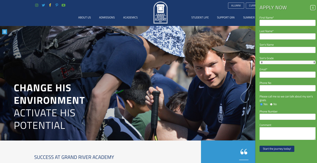
For example, as part of Grand River Academy's homepage's features, when you click the "Apply Now" button, a form pops out from the right-hand side that allows you to apply to the school without causing a disruption in the journey or user experience.
Key Takeaway
Factoring the student's enrollment journey into a school's website design is essential for boosting inquiries and enrollment rates. By focusing on an engaging user experience, streamlining form accessibility, and strategically placing calls-to-action, your school can effectively guide prospective students through the awareness, consideration, and decision stages, ultimately influencing their decision-making.


ABOUT THE AUTHOR
Connor has spent the last decade within the field of marketing and communications, working with independent schools and colleges throughout New England. As Finalsite’s Senior Content Marketing Manager, Connor plans and executes marketing strategies and digital content across the web. A former photojournalist, he has a passion for digital media, storytelling, coffee, and creating content that connects.


